Design · 5 min read
Menu design that works at the table.
Good restaurant menu design barely gets noticed: guests find what they want quickly and recognize your place. These points help more than any fancy font.
Readable on a phone first
Guests read your menu at the table on their phone, often in dim light. What looks elegant on a big screen can be too small or too thin on a phone. Check every design on your own phone – at a table and in evening light.
- A clear typeface for dish names and prices instead of ornate script
- Descriptions not in very thin or very light type
- Capitals only for short headings, not for descriptions
Enough contrast between text and background
The W3C's Web Content Accessibility Guidelines (WCAG 2.1) ask for a contrast ratio of at least 4.5:1 for normal text and 3:1 for large text. Large means at least 18 point, or 14 point bold. That's a good benchmark even though your menu isn't a government website.
Light gray on beige or text placed right on a photo quickly falls below these values. Online contrast checkers show you the ratio for any two colors.
Light or dark?
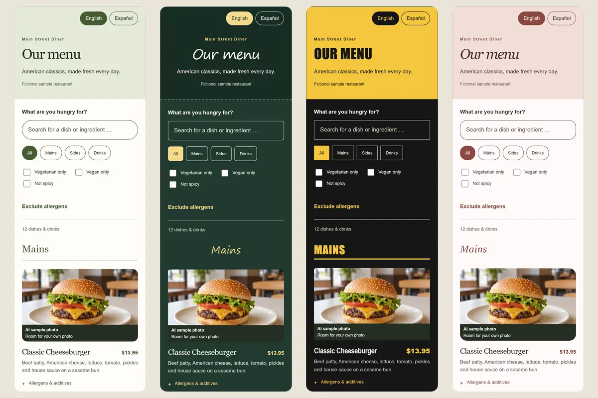
Light designs feel calm and suit cafés, lunch spots and bakeries. Dark designs create atmosphere in a bar, a grill or an evening restaurant – but they need especially strong contrast: light text, no dark gray descriptions, clearly visible prices.
Decide by your restaurant and the time of day most guests come in, not by how it looks on your laptop.
A design that fits your restaurant
Guests should feel at the table that the menu belongs to your place. A trattoria can be warm and playful, a street food stand bold and direct. Your logo goes at the top, small and easy to recognize.
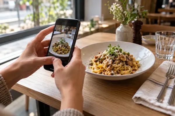
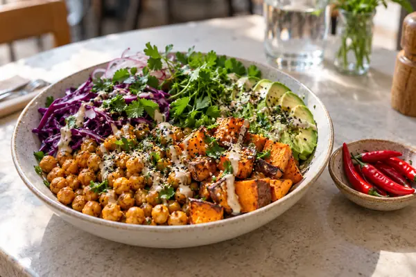
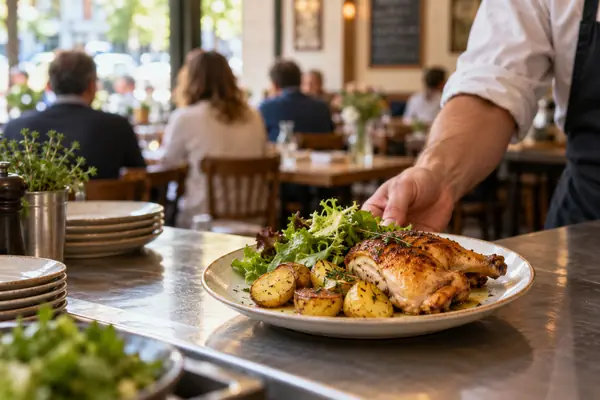
For the cover image, use a real photo of your restaurant or a signature dish. A stock photo of food you don't serve sets the wrong expectations.
Structure carries the design
Even the nicest design doesn't help if guests have to hunt. Order categories the way people eat, keep category names short and descriptions to one or two sentences.
Show prices in one consistent format like “$12.50” – no mix of “12.5” and “12.50 USD”. Guests should find the price without searching.
Photos: few and real
- A few good photos beat many that don't match
- Only photos of your own dishes, the way you serve them
- Same spot, same light, same angle – the menu looks calm
- A menu without any photos is perfectly fine if text and structure are right
Table tents and menu that match
Pick up the colors and logo of your digital menu on the table tent. After scanning, guests know right away they're in the right place. Still print the QR code itself dark on a light background.
And: a good design only works with current content. If prices and dishes are off, guests notice faster than any color choice.
How Plateclick helps
Plateclick offers twelve designs – from light and calm to dark and bold, such as “Garden”, “Café”, “Midnight” or “Chalkboard”. Add your logo, a cover image and, if you like, photos of your dishes. On the sample menu you can switch between all designs directly.
Plateclick formats prices consistently, and the preview shows right away how guests see your menu. If you switch designs later, the menu link and QR code stay the same.