Design · 4 min read
A menu that explains itself.
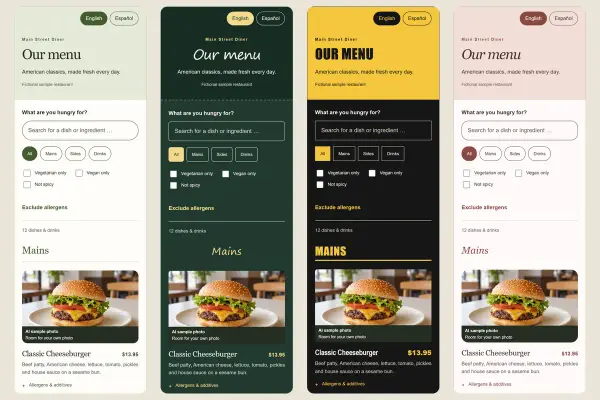
On a phone, guests scroll instead of flipping pages. A clear structure helps them find the right dish quickly – and helps you keep the menu up to date.
Few, clear categories
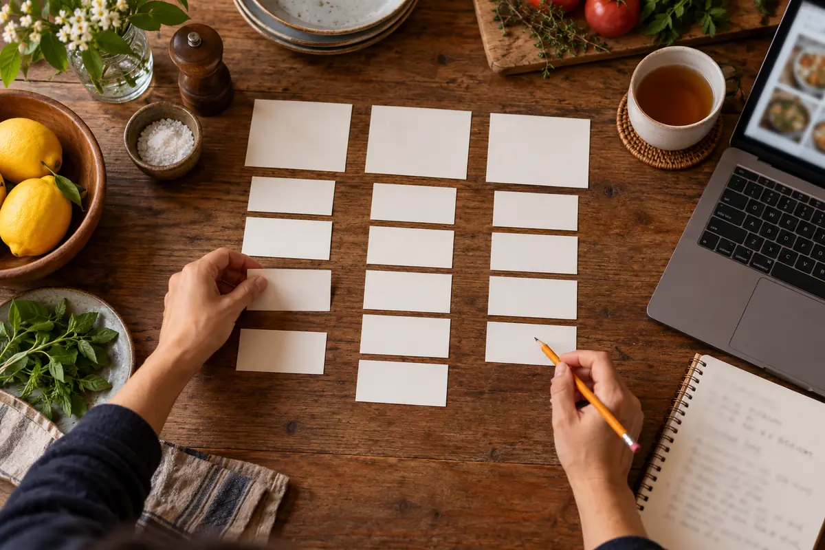
Organize the menu the way guests order: starters, mains, desserts, drinks. Six clear categories beat twelve half-empty ones. In Plateclick, categories appear as navigation at the top of the menu, so short names work best.
Choose the order on purpose
Put categories in the order people eat, or the most important first – like lunch specials. Keep similar dishes together within a category. You can reorder categories and dishes in the workshop with a few clicks.
Dish names and descriptions
- The name says what's on the plate; creative names need an explanation.
- The description lists main ingredients and sides in one or two sentences.
- Set the “vegan”, “vegetarian” and “spicy” labels on the dish; guests can filter by them.
- Skip all-caps blocks and exclamation marks – they make reading harder.
Consistent prices
A consistent format like “$12.50” is easier to read than a mix of “12.5” and “12.50 USD”. Plateclick formats every price the same way, in your menu's currency.
Less is often more
A shorter menu is easier to read, easier to keep current and easier for the kitchen. When a dish runs out, mark it “Sold out today” instead of deleting it.